- 2025
-
-
-
-
-
-
-
-
-
-
-
-
-
-
-
-
-

-
-
-
-
-
-
-
- 2010
-
-
-
-
-
-
-
-
-
-
-
-
- 2000
-
-
-
-
-
-
-
-
-
-
-
-
-
-
-
-

-
-
-
-
- 1990
-
-
-
-
-
-
-
-
-
-
-
-
-
-
-
-
-
-
-
-
-

-
-
- 1980
Kodak (Böwe Bell+Howell)
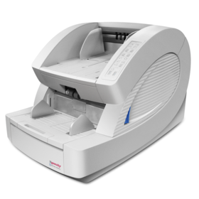
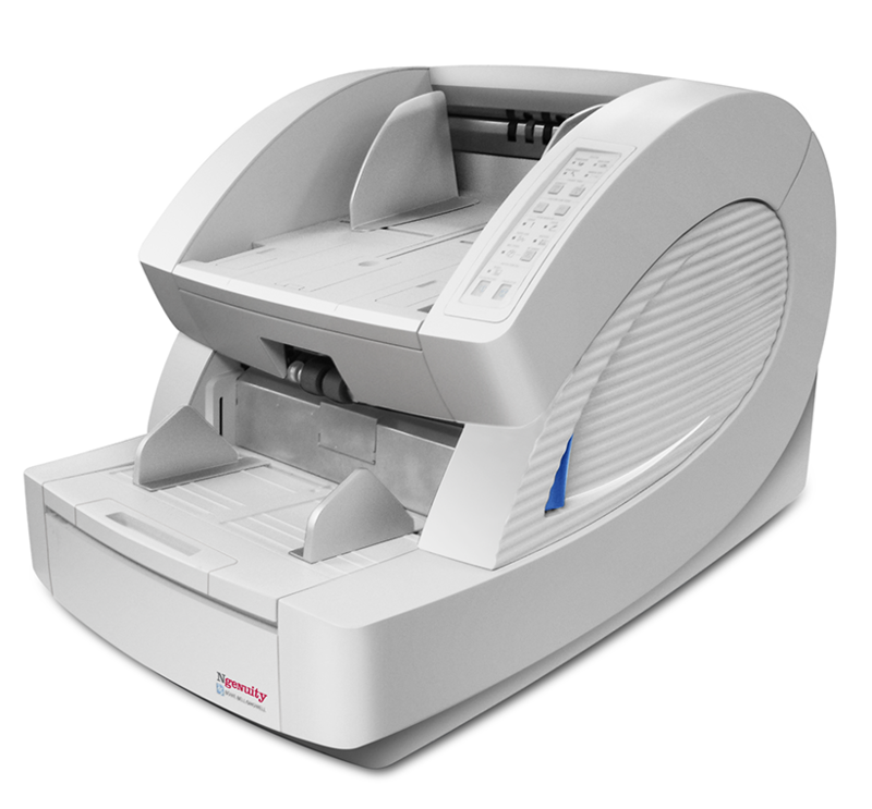
Ngenuity Document Scanner
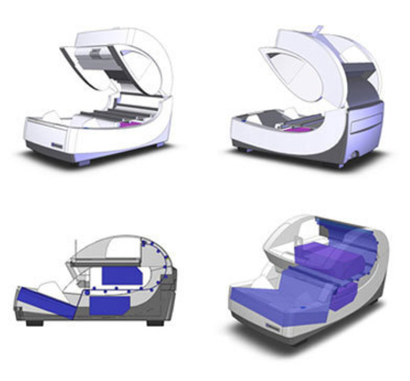
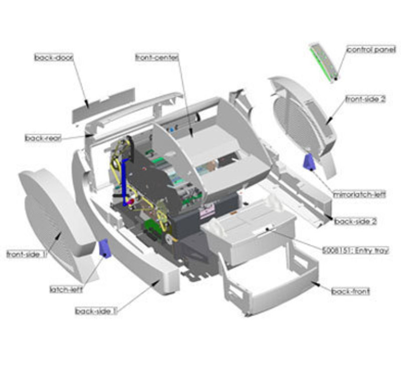
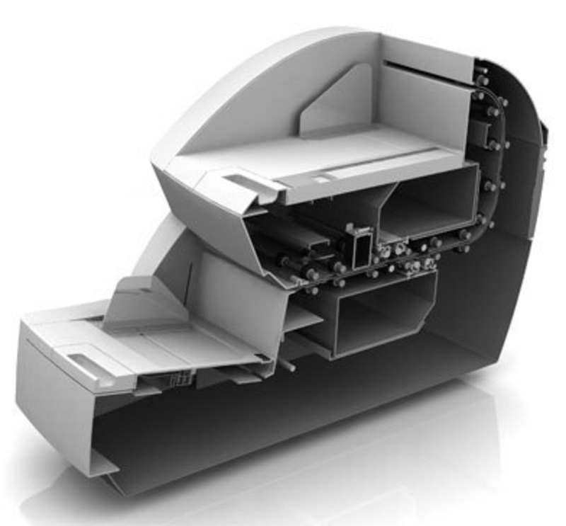

Design Team: Cesaroni Design & Böwe Bell+Howell
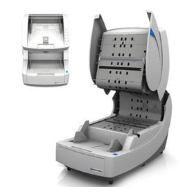
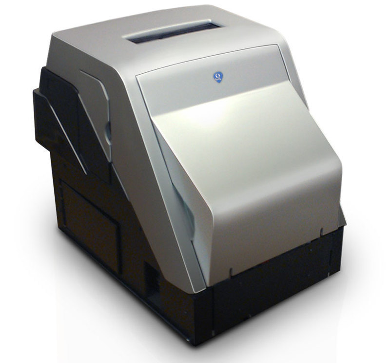
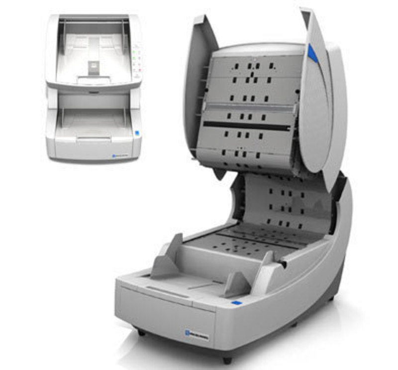
Böwe Bell+Howell collaborated with Cesaroni Design to develop the next generation office product. The project team paid close attention to detail throughout the design and development process in order to produce a premium fit and finish, and improved user experience. Working concurrently with the client's new product development team, we fine tuned the design as they handled the formal engineering.
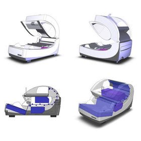
Our product design firm began the project with a detailed analysis of the client's existing product line and competitive products on the market. Research led to exploration in the form of concept sketches to identify opportunities for aesthetic differentiation. The project team narrowed down concepts that were then illustrated as concept renderings for further aesthetic evaluation.
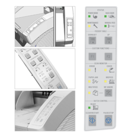
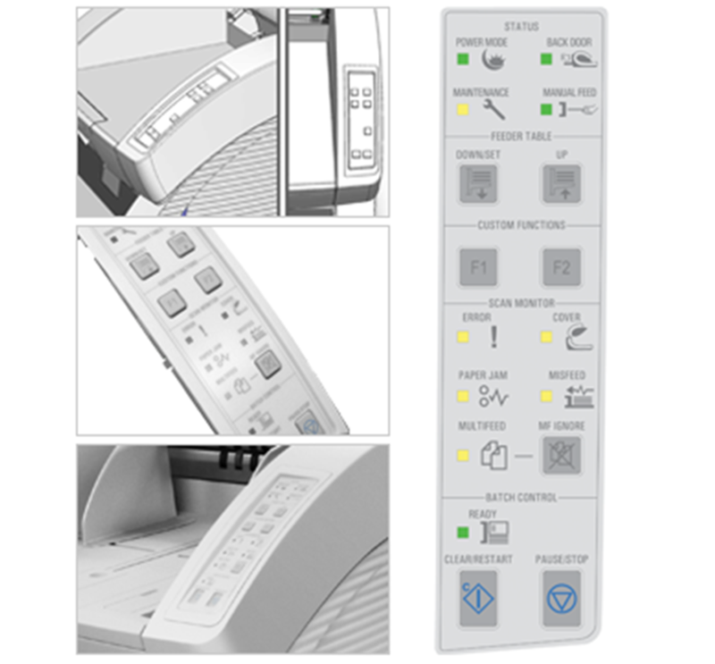
Basic anthropometrics drove form development and location of user interface elements. We developed ergonomic illustrations and a full scale mockup for testing ease of use. An otherwise complicated device was simplified and made user-friendly through the custom icon designs on the control panel.
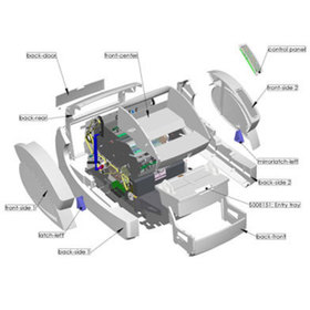
The new configuration was detailed for the final design in SolidWorks to move toward prototype development. We also made material recommendations, and supported new procedures for manufacturing and assembly.
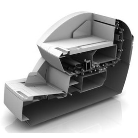
The product designers created a unique form to establish strong brand recognition. The original concept's dynamic curve was retained by continually refining the initial design in response to the internal configuration development handled by Böwe Bell+Howell.
The dynamic curve minimizes the overall size, and reflects the action taking place internally. A repetitive chamfered detail on the sides adds visual interest to the large surface. The main access latch is located on the side to pivot the top half of the machine open for accessing internal components. The project team increased the feeder tray capacity by 40% as compared to the competition.


