IDEA Silver , 2005
Life Fitness
Signature Series Strength Machines
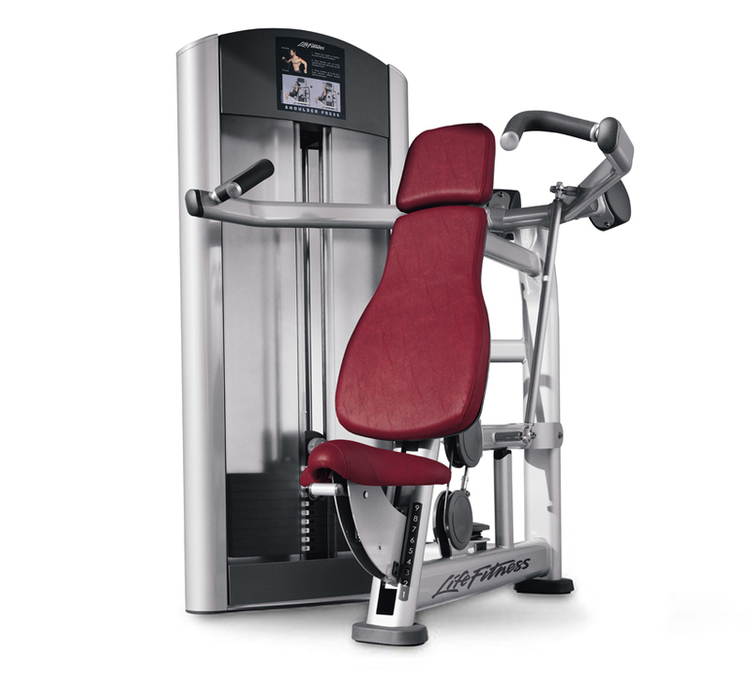
In response to health clubs investing heavily in the visual and emotional impact of their facilities, Life Fitness wanted to develop a new brand identity for their new commercial strength machine product line. The client's objective was to create an approachable machine with improved user interface.
Visual brand recognition is established through a balance of scale, proportion and form that creates approachable strength machine products. The overall silver and chrome color selection lightens the form to reduce the level of intimidation.
Soft shapes and tube locations open the user area making it less confining. The pulley used to guide the lifting cable and pivot points are covered with plastic. These plastic covers make the machine more inviting with a clean integration of functional elements.
Instructional plaques designed for each machine illustrate how to use the product and the muscle groups being worked. User interface design components like the handle, lever and knob share common aesthetic details, color breakups and materials. This design strategy is implemented into over 15 different product iterations. As a result, the learning curve is shortened when moving from one machine to another.
This new strength machine product line received an IDEA award.

IDEA Bronze , 2005
Health o meter® Professional
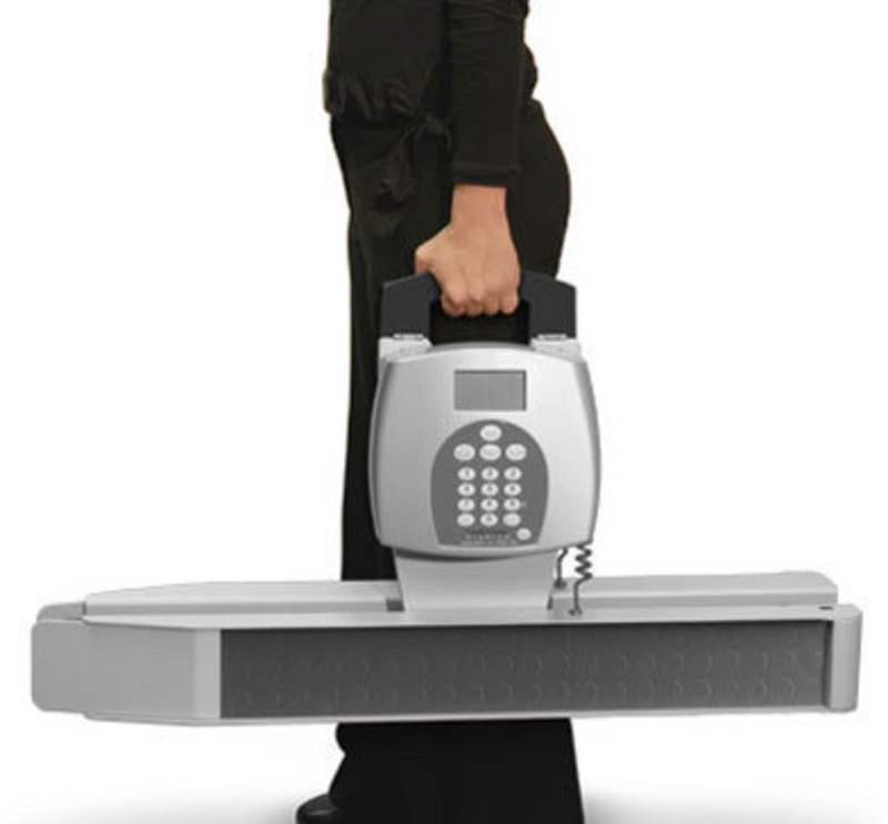
ProPlus® Portable Wheelchair Scale
Health o meter® Professional teamed with the Cesaroni Design industrial design firm to develop an award winning medical device. We began the project with concept sketches and renderings to evaluate a range of aesthetic and ergonomic design options.
The new medical product is constructed of laser cut and brake-formed aluminum. This made the product 2 pounds lighter than the previous model. The lighter weight, centrally located and comfortable handle, and folding capability make the product easy to transport.
The simplicity of the design was critical in order for the unit to be aesthetically appealing in both its portable and in-use positions. Fabricating a product out of aluminum requires attention to every bend and resulting gap. The design team paid close attention to the integration of the fabricated aluminum with the injection molded enclosure. This integration is clean, with compatible form factors and minimum exposed fasteners.
The enclosure for the user interface design is made from injection-molded ABS. The oversized backlit LCD display makes reading easier for the user. The interface design consists of a polycarbonate membrane switch keypad, and the LCD displays a menu for ease of operation.
The new medical design earned IDEA Bronze and a Good Design award.

EID First Place , 2005
CFM Home Products
Dyna-Glo Delux Kerosene Heater
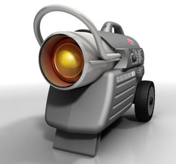
CFM Home Products collaborated with Cesaroni Design to aesthetically transform their current product line. Our product designers refined form factors, color schemes and instructional graphics from preliminary sketches through prototyping.
Cesaroni Design's industrial design team proposed constructing the new unit with a blow-molded polyethylene fuel tank, instead of the traditional stamped steel tank. This manufacturing method gives the new unit a distinctive look and feel and is as durable as the previous model.
Our product design firm reduced production costs by simplifying manufacturing and assembly processes. The previous unit required 12 screws and 5 parts for assembly. Our new product design requires only 4 screws and 3 parts.
The product designers developed a plastic top cover to integrate the fuel tank and protect the heat tube. This protective cover can be removed by the user to access internal components.
The ergonomic handle design gives the user the ability to lift and pull the device. We positioned the user interface higher for better viewing.
The new product design earned EID First Place from Appliance Design Magazine.

EID Runner Up , 2005
Bladez, Inc.
ION 150 Electric Scooter
Cesaroni Design and Bladez developed this recreational product for the teenage demographic. Speed to market was of the utmost importance in our new product design strategy.
The Cesaroni Design new consumer product design firm considered aesthetics, ergonomics, user interface and materials in our new consumer product design and development process.
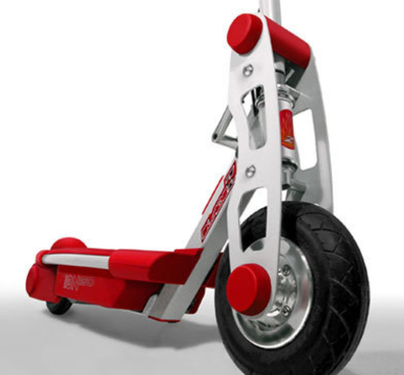
Bright red and silver metallic colors were selected by the client for the new recreational product to indicate speed and fun to consumers. Enough of the steel frame is exposed to reflect durability.
Cesaroni Design's project team fine-tuned the size of the deck, handlebar height, grip width, folding mechanism and spring tension to accommodate different sized consumers.
Our industrial design firm increased battery life and travel distance by developing a lightweight product with a push start feature. This feature increases battery life by using human power, instead of battery power, to start the electric motor. The product designers developed a single-piece injection molded riding deck to function as the service door to recharge the battery or access the motor.
The product is manufactured with high-volume production methods and a minimal number of parts. Materials include a powder coated tubular steel frame with laser cut steel upright struts, and injection molded polypropylene deck, under carriage and end caps. The decals are rear-printed polycarbonate.
The entire process, from research through first production parts, took 6 months, which helped our client launch the product as scheduled.
This recreational product design is an Excellence in Design winner.

GOOD DESIGN , 2005
Health o meter® Professional
ProPlus® Portable Wheelchair Scale
Health o meter® Professional teamed with the Cesaroni Design industrial design firm to develop an award winning medical device. We began the project with concept sketches and renderings to evaluate a range of aesthetic and ergonomic design options.
The new medical product is constructed of laser cut and brake-formed aluminum. This made the product 2 pounds lighter than the previous model. The lighter weight, centrally located and comfortable handle, and folding capability make the product easy to transport.
The simplicity of the design was critical in order for the unit to be aesthetically appealing in both its portable and in-use positions. Fabricating a product out of aluminum requires attention to every bend and resulting gap. The design team paid close attention to the integration of the fabricated aluminum with the injection molded enclosure. This integration is clean, with compatible form factors and minimum exposed fasteners.
The enclosure for the user interface design is made from injection-molded ABS. The oversized backlit LCD display makes reading easier for the user. The interface design consists of a polycarbonate membrane switch keypad, and the LCD displays a menu for ease of operation.
The new medical design earned IDEA Bronze and a Good Design award.

Top Ten Home WIRED Tools , 2005
Sub-Zero, Inc.
PRO 48 Refrigerator-Freezer
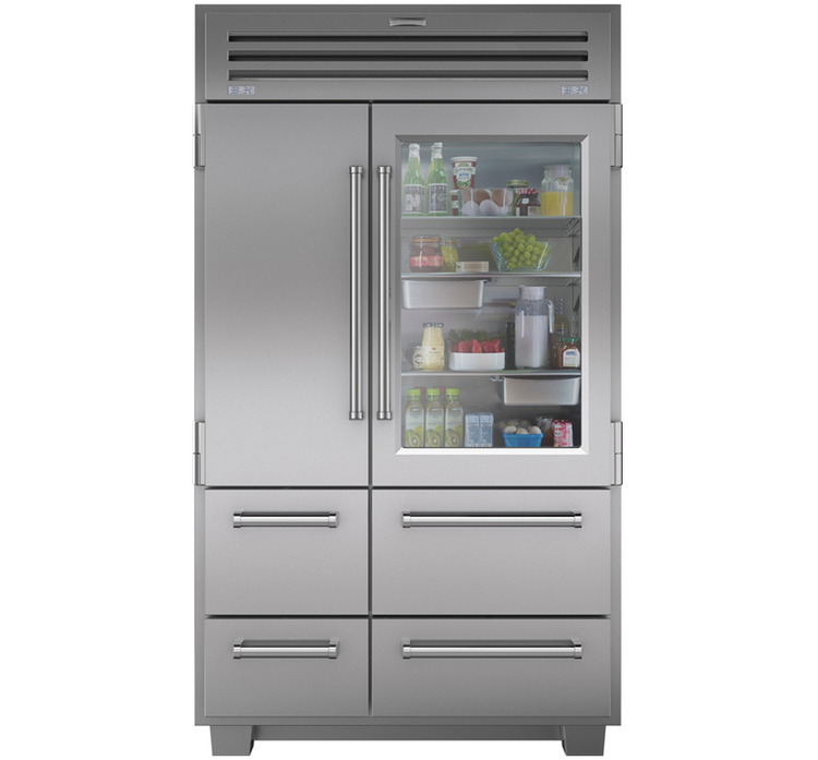
The Cesaroni Design industrial design firm worked closely with the marketing and engineering teams at Sub-Zero to create a new concept of food preservation. The PRO 48 is the largest combination unit the client offers. This appliance can be freestanding or built-in for a more integrated look.
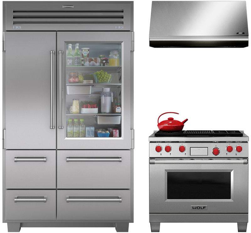
The appliance is constructed of almost 100% stainless steel. A glass door offers an elegant transparency to an otherwise stainless steel sculpture. The refrigerator cavity is designed with channeled sidewall LED lighting that acts as a door area night light.
Innovative human factors considerations drove the development of the new product design. A unique auto-close system utilizes precision built hinges to prevent the door from slamming shut. The cam takes over to close the door the final 15-degrees.
Two stainless steel bins are designed to fit under the refrigerator shelf. The versatile design is oven-safe so a consumer can marinate meat in the bin overnight, and then transfer it directly to the oven.
An upper drawer is a crisper compartment specifically developed to store vegetables. Its clear view window enhances visibility inside the compartment. The drawer divider design is interchangeable for complete compartmentalization.
The electronic control system gives the consumer the ability to set a different temperature for the two refrigerator drawers from the temperature for the door cavity. The temperature in three separate areas is digitally displayed on the exterior of the appliance.
This new appliance design was featured in WIRED Magazine as Top Ten WIRED Tools and was also recognized by The Chicago Athenaeum with a Good Design Award.

Top Ten Home Wired Tools, 2005, 2005
Sub-Zero, Inc. & Wolf Appliance, Inc.
Pro Collection
This multiple award winning product line of Refrigerators and Dual Fuel Ranges is a leader in the industry of major appliances.
PRO 48 Refrigerator-Freezer:
This unit is the largest combination unit Sub-Zero offers. This
appliance can be freestanding or built-in for a more integrated look.
The appliance is constructed of almost 100% stainless steel. A glass door
offers an elegant transparency to an otherwise stainless steel sculpture. The
refrigerator cavity is designed with channeled sidewall LED lighting that acts
as a door area night light.
Innovative human factors considerations drove the development of the new
product design. A unique auto-close system utilizes precision built hinges to
prevent the door from slamming shut. The cam takes over to close the door the
final 15-degrees.
Two stainless steel bins are designed to fit under the refrigerator shelf. The
versatile design is oven-safe so a consumer can marinate meat in the bin
overnight, and then transfer it directly to the oven.
An upper drawer is a crisper compartment specifically developed to store
vegetables. Its clear view window enhances visibility inside the compartment.
The drawer divider design is interchangeable for complete compartmentalization.
The electronic control system gives the consumer the ability to set a different
temperature for the two refrigerator drawers from the temperature for the door
cavity. The temperature in three separate areas is digitally displayed on the
exterior of the appliance.
Dual Fuel Ranges:
The project challenge was to create consumer ranges with commercial performance
bringing the Wolf brand name into stronger market visibility. Our client's
technological innovations required the integration of new energy efficient and
user-friendly electronic controls into the new product line, without losing
their professional brand identity.
The industrial designers walked a fine line between looking too commercial and
too residential. The unique design solution played down the sophisticated
electronics and featured the durability of commercial equipment. This design
strategy established a level of aesthetic detail refinement that could
integrate the appliance into vastly different residential kitchen environments.
The project team developed full scale foam core mockups to maximize user
experience. Model testing helped the project team evaluate the user interface
design. This ensured that the concealed electronic control panel would pivot
open at an appropriate ergonomic viewing angle.
Another innovative ergonomic feature is the patented control knob design. This
unique design incorporates LED lighting technology to display the temperature.
Function graphics are printed on the most visible surface for easy legibility.
The exterior of the new appliance design is constructed of stainless steel with
an elliptically shaped stainless steel handle and investment cast stainless
steel end caps. The porcelain-coated cast iron burner grates appear
commercially robust. They are cored out from the bottom in order to be easily
removable for cleaning.
Wolf Appliance has been ranked #1 by J.D. Power and Associates in the
Range/Cooktop/Oven category of their 2010 Home Appliance Study. This
satisfaction study is based on ease of use; performance and reliability;
styling and feel; features; and warranty.
This award winning major appliance design won both an Excellence in Design
Award and a Good Design Award for the new product design.

Best of Fitness , 2005
Life Fitness
Classic Series Treadmill
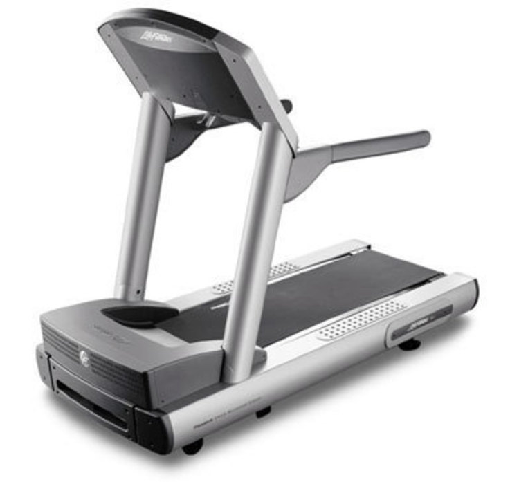
Close collaboration between Cesaroni Design and Life Fitness helped develop a family look for the new commercial fitness product lines. The visual branding of the commercial strength product line is integrated into the development of this new cardio product.
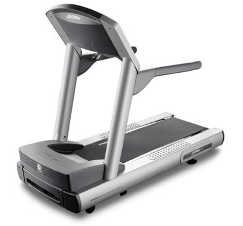
The design team selected colors to visually lighten the machine and unify the new commercial fitness product lines. The overall size and visual mass of this new cardio product is reduced to create an approachable and inviting machine.
The project team also reduced the height of the console so that users can see over the top. This made the machine feel less confining. The console features large contrasting buttons and readouts for improved user interfaces.
The side handles are a steel structure covered with a soft grip material to give the user a more comfortable feel. Custom molded grip pads are designed for the deck side rails. These pads give users a safe foot grip when moving on and off the machine.
This new treadmill product design was recognized by Health Magazine as Best of Fitness and received an EID award.

Multi-Part Enclosure Award , 2005
Gendex Dental Systems (KaVo)
Orthoralix® 8500 Panoramic X-Ray Unit
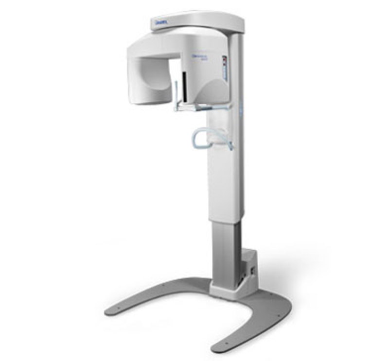
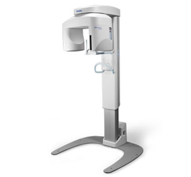
Gendex Dental Systems and Cesaroni Design product designers developed this diagnostic imaging product. The engineering was handled by our client, while we focused on optimizing a lightweight structure. We worked closely with our client's engineering team to understand assembly and service requirements.
Multiple medical product design concepts were generated, all of which satisfied the project objectives. We then implemented the chosen concept in 3D CAD. The resulting part files were shared with Gendex's development team for further review.
The adjustable telescopic column is one of the most significant elements of the design. This component makes the unit extremely compact. It also enables the system to accommodate patients of all sizes, including children and wheelchair-bound patients.
Ergonomic diagrams assisted the development team in analyzing the design for the handlebar and chin rest so that the patient is held in a stable and comfortable position. Molded polycarbonate and carbon fiber patient supports are mounted on powder-coated handlebars.
The new product design increases workflow, giving the operator the ability to access mouthpieces and other accessories strategically located behind the handlebar in a rotating storage drawer. Interface elements and electronic controls were developed for ease of use.
The new design of the pressure-formed housing reduces the weight of the product, making it one of the lightest units for the medical industry. Pressure-forming offered low tooling costs and faster speed to market than injection molding. The housing facilitates an effortless assembly in the manufacturing process and installation procedure.
The dental product design earned numerous awards, including a MDEA Silver award, Good Design award and a Multi-Part Enclosure award.

